



Directives de conception de l’embossage sur tablette pour des marques claires et durables
Clear tablet marks begin with simple artwork, balanced feature geometry, enough spacing, and placement that respects the tablet profile. The design must also work with the actual formulation, compression conditions, and coating process. A mark that looks correct in a drawing can still pick during compression or lose definition after film coating.
Punch-tip markings are only one part of the tooling system. For broader information about punches, dies, tooling families, and press compatibility, see Types d’outils de presse à tablette. This guide stays focused on the design and validation of the mark itself.
There is no universal stroke depth, angle, width, or spacing that works for every product. Published dimensions are starting points. Final geometry must be tested with the intended tablet profile, formulation, press, coating, and identification requirements.
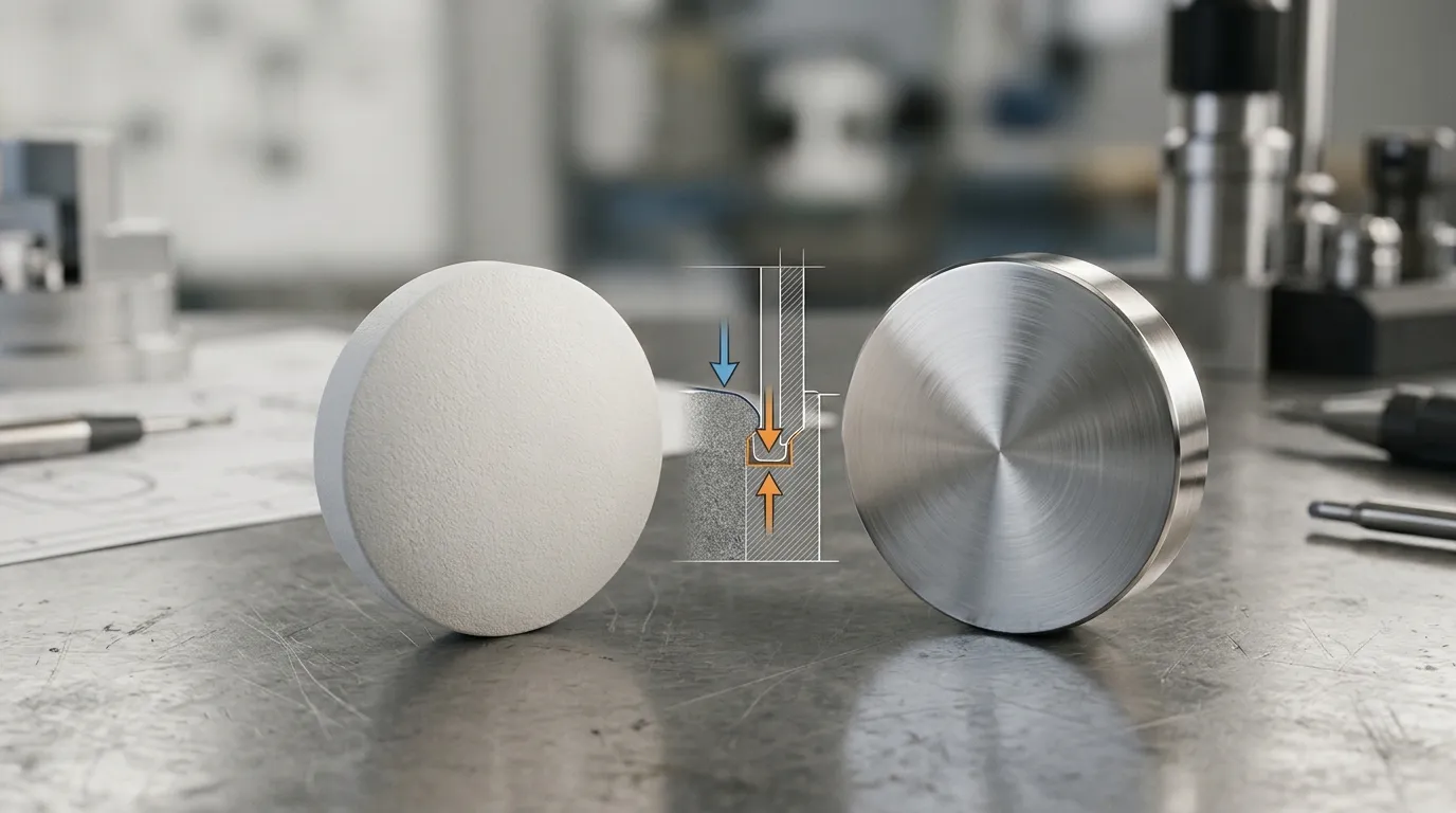
Embossed, Debossed, Engraved, and Imprinted: Define the Mark First
Tablet and tooling teams do not always use embossing terminology in the same way. A controlled drawing should therefore describe both the punch feature and the intended result on the finished tablet.
Under the U.S. definitions in 21 CFR Part 206, an embossed mark is raised above the surface of the dosage form, while a debossed mark is below the surface. An engraved mark is cut into the dosage form after it has been completed. “Imprinted” is the broader term covering marks made by embossing, debossing, engraving, or printing.
| Mandat | Finished-tablet result | Corresponding punch-face feature |
|---|---|---|
| Embossed mark | Raised above the tablet surface | Recessed feature in the punch face |
| Debossed mark | Recessed below the tablet surface | Raised feature on the punch face |
| Engraved mark | Cut into the finished dosage form after formation | Not necessarily formed during compression |
| Imprint | General identification mark | May be produced by several methods |
The inverse relationship matters. A raised letter on the punch produces a recessed letter on the tablet. A recessed letter in the punch produces a raised tablet feature.
Drawings should not rely on labels such as “emboss logo” alone. They should state:
- whether the finished tablet mark is raised or recessed;
- which punch face carries the feature;
- the intended mark orientation;
- the controlled artwork revision;
- which dimensions apply to the tool and which apply to the finished tablet.
This prevents a supplier, product team, and quality team from approving different interpretations of the same artwork.
Start With the Identification Requirement, Not the Original Artwork
The original logo is rarely the best starting geometry for a tablet punch. Branding artwork may contain thin lines, sharp corners, small gaps, or decorative details that cannot be reproduced reliably at tablet scale.
Begin by defining what the mark must communicate:
- product or manufacturer identity;
- dosage strength;
- letters or numerals used for differentiation;
- a logo or symbol;
- a combination of these elements.
Identification should take priority over decorative fidelity. The U.S. FDA’s guidance on product design and medication-error prevention recommends clear differentiation among drug products and strengths. Other markets may apply different regulatory requirements, so the final design needs jurisdiction-specific review.
A practical artwork review can divide details into three groups:
| Décision | Typical treatment |
| Retain | Essential letters, numerals, strength identifiers, and recognizable logo elements |
| Simplify | Fine curves, narrow gaps, decorative terminals, closely spaced elements, and complex enclosed areas |
| Remove | Details that do not contribute to identification or remain legible at tablet scale |
For product families, review the smallest tablet and the most crowded face first. A logo that fits comfortably on a large tablet may fail when scaled down for a lower-strength version. It is also risky to produce several strengths with codes that differ by only one small or easily obscured feature.
Anti-counterfeiting details may support product identification, but extra complexity should not compromise readability, manufacturability, or coating performance.
Convert Letters and Logos Into Manufacturable Feature Geometry
A tablet mark is a three-dimensional feature, not flat artwork. Its performance depends on the relationship among stroke width, depth, wall angle, radius, and spacing.
Changing one variable affects the others. A deep feature with narrow strokes may be difficult to release or coat. A wide but very shallow feature may lose definition after spring-back or handling. Closely spaced characters may appear separate on the uncoated core but merge after coating.
| Geometry variable | Fonction principale | Risk when poorly balanced |
| Stroke width | Creates visible line weight and structural support | Thin strokes may wear, fill, or become fragile |
| Feature depth | Creates relief and visual definition | Excessive depth may increase powder retention or coating infill |
| Wall angle | Supports release from the punch feature | Steep or abrupt walls may increase local retention |
| Bottom radius | Removes sharp internal transitions | Sharp bottoms may trap material or concentrate stress |
| Character spacing | Keeps features visually separate | Narrow gaps may pick, bridge, or disappear after coating |
| Rayon d’angle | Reduces acute geometric details | Sharp corners may be weak or difficult to reproduce |
Recherche sur debossed-feature formation in pharmaceutical tablets shows that stroke angle, pre-pick geometry, lubricant conditions, material density, and elastic recovery can affect feature fidelity. This means the dimensions in the punch drawing will not always appear unchanged on the finished tablet.
Some tooling guides publish recommended angles, depth-to-width relationships, or radius proportions. These can be useful starting points, but they are not universal standards. Feature size, formulation behavior, tablet curvature, coating requirements, and the measuring convention all influence whether a particular proportion is suitable.
Choose Font and Stroke Forms for Uniformity
Sans-serif fonts are often easier to adapt because they can use more uniform line widths and fewer decorative terminals. Serif fonts may contain thin ends, narrow transitions, and partially enclosed details that become fragile when reduced.
This does not mean every serif design must be rejected. The practical question is whether the selected font can be modified to maintain:
- consistent stroke weight;
- readable open spaces;
- rounded internal corners;
- adequate separation;
- sufficient feature support;
- recognizable character shapes.
A custom technical font may work better than preserving a standard commercial typeface exactly. The finished tablet needs to remain identifiable; it does not need to reproduce every typographic detail in the source file.
Balance Width, Depth, Angle, Radius, and Spacing
These variables should be reviewed together rather than approved one at a time.
A deeper mark can improve initial visual definition, but it may also create narrow areas that fill during coating. Increasing stroke width may improve durability, but excessive width can close counters or reduce spacing between characters. Rounding the bottom and corners can support release, yet excessive rounding may soften a small character until it becomes difficult to distinguish.
The design should preserve enough contrast for identification without creating isolated, steep-sided, or tightly packed features. Trial tablets are needed to confirm that the chosen balance survives compression, ejection, coating, and handling.
Redesign Counters, Islands, and Peninsulas Before They Cause Picking
Enclosed and partially enclosed character areas are frequent sources of tablet picking.
A counter is the enclosed space within a character. The tool feature surrounded by that space is sometimes described as an island. Letters and numerals such as A, B, D, O, P, R, 0, 6, 8, and 9 contain enclosed regions. A peninsula is a partially enclosed projection, such as the inner portion of some letters or logos.
These areas can compact and release differently from the surrounding tablet face. Material may remain attached to the punch feature and pull away from the tablet, leaving an incomplete mark.
| Risky feature | Typical problem | Possible design response |
| Small enclosed counter | Local material retention | Open or enlarge the counter |
| Tall isolated island | Picking around the enclosed feature | Reduce the feature height or depth |
| Narrow peninsula | Weak transition and local picking | Taper or ramp the peninsula |
| Sharp internal corner | Powder trap or stress concentration | Add an appropriate radius |
| Two close counters | Inadequate material separation | Increase spacing or simplify the character |
An open counter removes part of the enclosure while preserving the character’s identity. Pre-picking, sometimes described as a reduced counter, intentionally reduces the vulnerable feature height or depth. A tapered peninsula blends the projecting feature more gradually into the surrounding surface.
These modifications involve trade-offs. An aggressive reduction may improve release but weaken the visual character. A wide opening may prevent picking but make two different letters look similar.
Pre-pick percentages and taper dimensions should therefore be treated as application-specific. The peer-reviewed study on debossed features found that pre-pick geometry and stroke angle influenced feature formation, but it did not establish one design that is correct for every formulation.
Keep the Mark Inside a Usable Safe Zone
The full visible tablet face is not automatically available for artwork. The safe zone is the practical area in which the mark can be placed without crowding the tablet edge, weakening the landed region, or creating difficult punch geometry.
The safe zone depends on:
- tablet size and shape;
- cup curvature;
- land position;
- mark orientation;
- the feature on the opposite face;
- any break line;
- expected coating buildup.
Artwork should not be scaled to the maximum theoretical area. Small changes during manufacturing or coating can make a mark that already sits close to the edge appear crowded or incomplete.
Placement also affects local performance. Moving an identifier away from the exact center may reduce a recurring local picking condition in some designs, but off-center placement is not universally better. It can create new balance, appearance, or inspection problems.
Use this placement check before approving the face layout:
- Keep critical strokes and character corners clear of the landed edge.
- Leave enough space for coating and visual separation.
- Check the design in its actual orientation, not only as isolated artwork.
- Compare both tablet faces together.
- Confirm that logos, codes, and functional lines cannot be confused.
- Review the smallest tablet in the product family.
A functional score line has different requirements from an identification mark. Where both features share one face, coordinate their spacing and visual hierarchy, then move the splitting analysis to the dedicated tablet break line design guide.
Match the Mark to Tablet Profile and Cup Depth
Tablet profile changes both the usable marking area and the compression conditions around the mark.
A shallow cup generally provides a flatter central region, while a deep cup creates greater curvature and can reduce the area available for detailed artwork. Placing a complex mark in a highly curved region may produce inconsistent stroke depth or crowd features near the edge.
| Profile consideration | Embossing implication |
| Shallow cup | Larger apparent marking area, but tablet performance still requires validation |
| Deep cup | Less usable central area and steeper curvature around the mark |
| Single-radius profile | Simple curvature but may concentrate design constraints in the center |
| Double-radius or compound profile | May provide additional control over central area and edge transition |
| Major profile change | Affects more than the mark and requires full tablet evaluation |
Cup depth can also influence local compaction. Detailed central features may behave differently if the formulation does not compact uniformly around the punch geometry.
Changing from one profile to another should not be treated as a minor embossing correction. It can affect tablet strength, handling, coating, and other product characteristics. The profile should only be changed through the broader product-development and validation process.
Design for the Coated Tablet, Not Only the Uncoated Core
A mark can be sharp immediately after compression and still fail on the final coated tablet.
Film coating adds material to the surface and exposes tablets to movement, contact, drying, and handling. The main imprint-related defects include:
- Bridging: coating spans across a recessed area instead of following its full contour.
- Infill: coating material accumulates within a feature and reduces its visible depth.
- Erosion: edges lose definition through movement or abrasion.
- Chipping: local tablet material breaks away around a feature.
- Softening: fine details remain present but become visually indistinct.
Narrow gaps and deep recesses are particularly vulnerable to infill. Sharp transitions may not coat evenly. Very fine raised features may lose definition through contact or abrasion.
| Coating-stage symptom | Possible design contribution | First design check |
| Characters merge | Inadequate spacing | Increase separation or simplify the artwork |
| Recess looks filled | Excessive depth or narrow cavity | Review depth, width, angle, and bottom radius |
| Fine lines disappear | Stroke too narrow | Increase line weight without closing nearby spaces |
| Edges look rounded | Detail too small for the coating system | Simplify the feature |
| Mark chips during handling | Weak local tablet geometry | Review feature location, profile, and tablet integrity |
Coating thickness and operating parameters vary by product. They should not be estimated from a general article. The correct test is to run the intended coating process and inspect the final tablet under the defined production and quality conditions.
Core-tablet approval alone is insufficient when the marketed product will be coated.
Diagnose Picking and Sticking Before Changing the Design
Picking and sticking are related but not identical.
Picking is usually localized. Material is removed from a specific tablet area and remains attached to a punch feature, often around a letter, numeral, island, or peninsula. Sticking is broader adhesion of the formulation to the punch face. Filming develops when a deposit gradually builds across part of the tool.
Le IQ Consortium review of sticking and picking describes these as multifactorial problems involving formulation, tooling, and manufacturing conditions. Geometry may contribute, but it is not the only possible cause.
| Observed pattern | Possible design cause | Possible non-design cause | First verification step |
| Defect repeats in one counter | Enclosed island or steep local feature | Local punch damage | Inspect the exact feature and tool surface |
| Material collects in several narrow strokes | Insufficient spacing or sharp geometry | High formulation adhesion | Compare marked and unmarked areas |
| Adhesion covers much of the punch | Unlikely to be only one character | Moisture, lubrication, humidity, compression conditions | Review formulation and process data |
| Defect worsens during the run | Deposit promotes further retention | Temperature, humidity, filming, tool condition | Track timing and operating conditions |
| Problem appears only after coating | Geometry may trap coating | Coating formulation or process variation | Compare core and coated tablets |
Tool steel and surface coatings may be relevant after the root cause is understood. They should not be the automatic first response to every mark defect.
Signs the Mark Geometry Is Contributing
Geometry is a stronger suspect when:
- the defect always appears in the same letter, numeral, counter, or peninsula;
- the failure follows one narrow gap or sharp corner;
- surrounding unmarked areas remain clean;
- the problem is consistent across otherwise stable operating conditions;
- a controlled geometry revision changes the local defect pattern.
This evidence does not prove that geometry is the only cause, but it helps narrow the investigation.
Signs the Root Cause May Be Elsewhere
Look beyond the mark design when:
- deposits appear across broad unmarked regions;
- severity changes with humidity, formulation moisture, or run time;
- the defect changes after adjusting compression conditions;
- lubricant level or distribution is inconsistent;
- scratches or damage are visible on the punch surface;
- multiple unrelated characters fail at the same time.
Several causes may operate together. A narrow counter can be marginal under normal conditions and begin picking only after humidity or formulation moisture increases.
Validate the Design Before Releasing Production Tooling
Artwork approval is not production validation. The mark must be evaluated with the intended formulation, tablet profile, press conditions, coating process, and final inspection requirements.
A practical validation sequence is:
- Confirm the identification requirement.
Record the required letters, numerals, strength information, logo elements, and market-specific constraints. - Freeze the artwork revision.
Use one controlled source file and document all simplifications. - Define the finished-tablet result.
State whether each feature must be raised or recessed and identify the corresponding punch-face geometry. - Review manufacturability.
Check stroke width, depth, angle, radius, spacing, counters, peninsulas, safe-zone clearance, profile, and score-line interaction. - Produce and test trial tooling where appropriate.
Evaluate mark fidelity, picking, sticking, tablet integrity, and tool condition under representative compression conditions. - Inspect after the intended coating process.
Check for bridging, infill, erosion, merging, and loss of identification. - Control acceptance and future revisions.
Record the approved artwork, tool drawing, inspection method, visual standard, and replacement-tool revision.
Information to Include in the Design Package
A useful supplier or internal design package should contain:
- controlled artwork and revision number;
- intended finished-tablet appearance;
- tablet dimensions, shape, and profile;
- mark assignment to the upper or lower face;
- break-line position, where applicable;
- formulation behavior relevant to sticking or spring-back;
- coating requirement;
- press and tooling-system context;
- visual and dimensional acceptance criteria;
- product-family or strength-differentiation requirements;
- required material, inspection, and traceability documentation.
Do not assume that a supplier will interpret a flat logo file, tablet sketch, and phrase such as “engrave this” in the same way as the product team.
Inspect the Core, Coated Tablet, and Replacement Tooling
Inspection should cover three stages:
| Scène | What to confirm |
| Uncoated core | Feature completeness, local picking, tablet integrity, and consistency during the run |
| Coated tablet | Final legibility, bridging, infill, erosion, and visual differentiation |
| Replacement tooling | Drawing revision, feature dimensions, orientation, and consistency with the approved result |
Where practical, retain approved visual samples or controlled reference images. These can help distinguish acceptable normal variation from a true loss of legibility.
Replacement tooling should reproduce the approved design revision rather than an uncontrolled copy of a worn tool or an outdated artwork file.
Tablet Embossing Design Review Checklist
Before releasing the design, confirm that:
- the terminology clearly separates the punch feature from the finished-tablet mark;
- essential identification content has priority over decorative detail;
- the artwork has been simplified for tablet scale;
- the font uses workable stroke forms and spacing;
- counters, islands, and peninsulas have been reviewed;
- depth, width, angle, radius, and spacing are balanced;
- critical features remain inside the usable safe zone;
- the mark does not conflict visually or physically with a break line;
- the tablet profile provides enough usable marking area;
- coating bridging, infill, and erosion have been considered;
- formulation and process causes have been checked before redesign;
- trial-compression and post-coating inspections are defined;
- visual and dimensional acceptance criteria are documented;
- artwork and tooling revisions are controlled.
Sunshine’s website states that it supplies general custom mold components and accepts drawing-based custom-part inquiries. It does not currently provide enough public evidence to claim pharmaceutical tablet-tooling or imprint-validation capability. Teams with a relevant custom-component requirement can contact Sunshine to confirm whether the requested part falls within its actual manufacturing scope.
Partager :


Écrit par Tonmoy
ACTUALITÉS
OBTENIR UN SERVICE
Avec des pièces de qualité adaptées à tous les budgets et un personnel accueillant formé pour rendre votre visite informative et sans tracas.
